Case study · Energy & sustainability analytics
When the grid is dirty, and what to do about it
A six year look at carbon intensity across Australia's National Electricity Market, and what it tells households, businesses and policymakers about the cheapest emission cuts still sitting on the table.
The problem
Most Australians have no idea their toaster is dirtier at 7 PM than at 11 AM. The electricity coming out of the wall isn't one product, it's a moving blend of coal, gas, hydro, wind and solar, and the mix changes every five minutes. That means the carbon footprint of charging an EV, running a factory line or boiling a kettle depends almost entirely on when you do it.
For a country with a legislated 2030 emissions target and a grid in the middle of a generational transition, that timing question matters. The business question I wanted to answer was deliberately blunt: across the National Electricity Market, when is the grid cleanest, when is it filthiest, and how different is that picture between states? If I could get a confident answer, the practical follow up writes itself. Households know when to run the dishwasher. Businesses know which shifts are quietly inflating their scope 2 number. Policymakers know which regions are decarbonising on autopilot and which ones still need a push.
The data
I pulled half hourly carbon intensity and dispatch data covering New South Wales, Victoria, Queensland, South Australia and Tasmania from January 2019 through April 2025, sourced from AEMO's public NEM feed and OpenNEM. On paper that's a tidy time series. In practice it was the usual mess.
Timestamps drifted between AEST and local time depending on the file. Tasmania had a chunk of 2023 where intensity readings looked impossibly low for a few weeks, and I had to decide whether that was a genuine hydro surge or a sensor problem (it was real, but the magnitude made me check twice). A handful of months in the company consumption dataset I layered in later contained one row with 1,685 kWh for an entire month against a 45,000 kWh baseline. That wasn't a holiday, it was a data export cut short, and leaving it in would have torpedoed the rolling averages.
None of this is glamorous, but it's where the analysis actually starts. I spent the first week just building a cleaning pipeline that resampled everything to a consistent half hourly index, reconciled regional labels, flagged the obvious export artefacts, and kept an audit log of what I dropped and why. By the time I started plotting, I trusted the numbers.
The approach
My first instinct was to go straight to a forecasting model. Six years of half hourly data feels like it's asking to be fed into Prophet or a seasonal ARIMA. I tried that early, and it taught me something useful: a model that predicts tomorrow's average intensity in NSW within 5% doesn't actually help anyone make a decision. The interesting questions weren't about the next day, they were about the shape of a typical day, and how that shape differed between a coal heavy state and a hydro dominant one.
So I pivoted. Instead of forecasting, I built intra daily average curves per region across the full six years, then layered seasonal cuts, year on year change calculations, and cumulative emission tallies on top. The point was to make the structure of the grid legible, not to predict it.
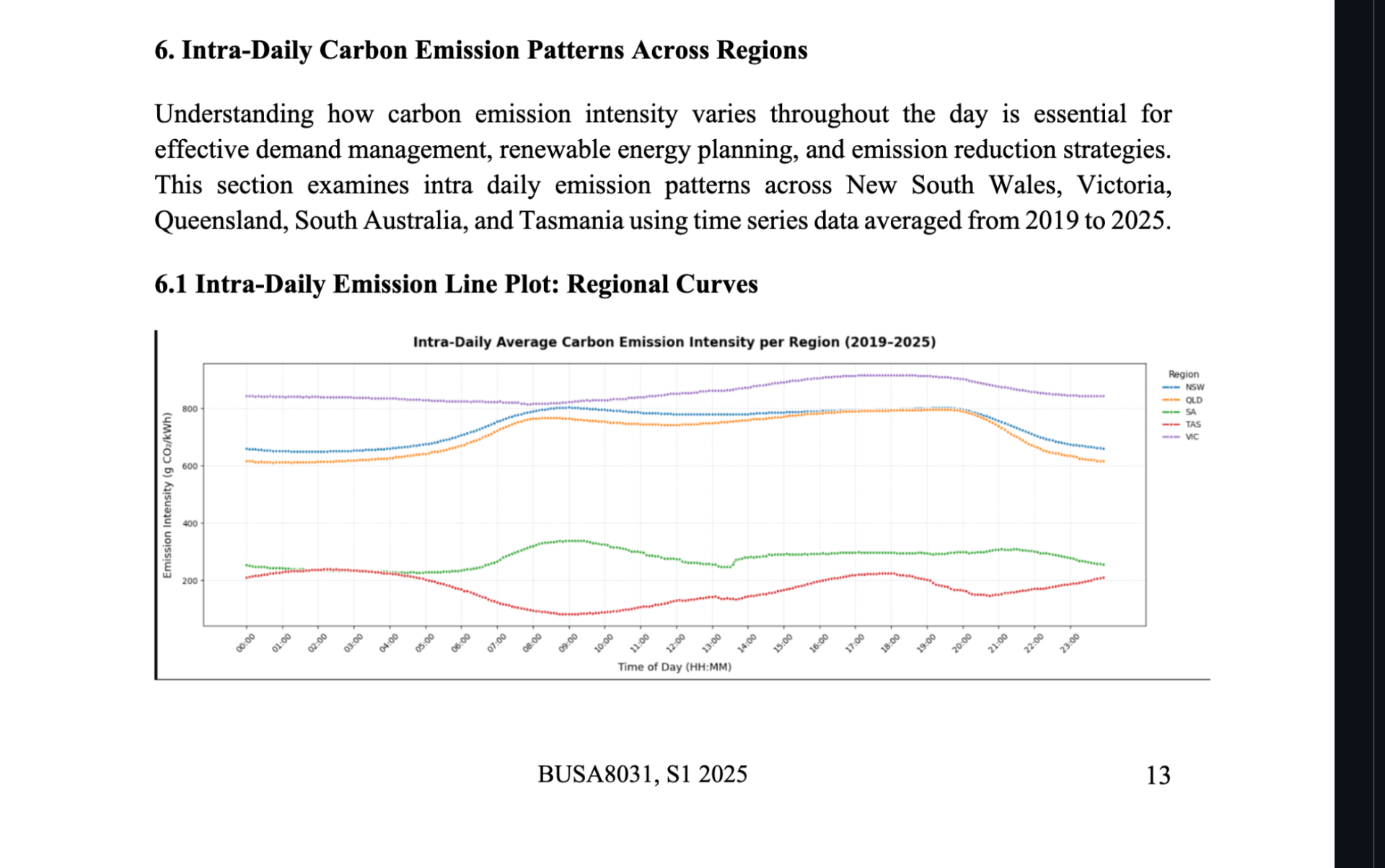
A few choices mattered. I averaged across years rather than picking a single representative year, because 2020 was warped by the pandemic and 2023 was warped by Tasmania's hydro anomaly. I grouped time into four blocks (night, morning, afternoon, evening) for the household versus company comparison because hourly granularity made the chart unreadable without adding any new insight. And I deliberately kept the visual palette consistent across every figure, one colour per region, so a reader scanning the report could follow a single state's story without re reading every legend.
The thing I got wrong first time round was treating all five states as if they followed the same logic. I built a single template for the daily curve, applied it to everyone, and was surprised when Tasmania looked like a different planet. It is. Hydro and wind dominant grids don't have the classic morning and evening peaks that coal and gas grids have, they have weather shaped variance instead. Once I stopped forcing one framing onto the whole NEM and let the regional shapes speak for themselves, the analysis got much sharper.
The result
The headline finding is plain: Victoria sits above 800 gCO₂/kWh for most of the day and pushes past 900 between 6 and 8 PM. Tasmania sits near 100 gCO₂/kWh during midday and rarely crosses 250. Those are not small gaps, they are roughly an order of magnitude apart on the same national grid.
Across the full window, Victoria contributed 31% of total NEM emissions, NSW 26.9%, Queensland 25.9%, South Australia 10%, and Tasmania 6.2%. Year on year, every mainland region trended down from 2020 through 2022, then most rebounded slightly in 2024 as coal stayed on longer than expected during peak demand events.
The company usage view, where I crossed business consumption patterns with regional intensity, made the demand shifting opportunity concrete. Companies in NSW, Queensland and Victoria run heaviest between 10 AM and 4 PM, exactly when grid intensity is highest. In Tasmania, the pattern flips: commercial hours are cleaner than residential evenings because hydro covers daytime load while evening demand pulls in firmer, dirtier generation. That nuance is the kind of thing a generic emissions factor misses completely.
What's next
The biggest limitation is that intensity alone doesn't buy you a decision. If I had more time I'd pair the carbon data with live wholesale pricing from AEMO, so the story shows both the financial and the environmental case for shifting load. That's the version a CFO actually signs off on.
I'd also model each region separately rather than assuming one architecture fits all five. South Australia's wind variability genuinely makes it harder to predict than NSW's fossil fuel baseline, and a region specific forecasting layer would unlock the next question: not just when the grid was clean, but when it's likely to be clean tomorrow morning at 9 AM, so a hot water system or an EV can plan around it.
Curious about the code, the cleaning pipeline, or the figures?
View on GitHub